Four label concepts to meet market challenges
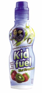
The marketing capabilities of the label are expanding beyond the field of product identification. Companies that are well-targeted can join the ranks of more complex, advanced tags to achieve their goals more efficiently. Clear Beverage's beautifully shaped bottles are easy for children to grab. Labels also achieve secondary goals by earning parental trust in the brand. Information such as “Key nutrients needed for body growth†is printed on the label to convey the natural and healthy benefits of Kid Fuel products.
New ways of thinking about the shelf impact of labels are reflected in the following three trends that are currently emerging in the retail space.
1) Businesses are looking for new ways to make packaging and the Internet work together to enable consumers to experience their branded products.
2) People are beginning to pay attention to packaging areas such as covers, as an additional advertising space to promote to consumers and make their appeals into action. The secondary label on the lid is a high-visibility component on the packaging that is not commonly used by businesses. It enables consumers to participate in their own activities and influence purchase behavior.
3) Forgery is a real concern for product brand owners who are responding with a dual-function tag. Such labels have special effects such as metallic luster on the one hand, allowing consumers to see the surface of the product or packaging; on the other hand, they also provide tamper-proof functions.
The following example describes how to implement these new label concepts and other labeling strategies on specific packages.
Idea 1: highlight the shape of innovation
Children want to drink their own beverages in bottles that are different from their parents' preferences. They like fun and adventure. Clear Beverage is a beverage company that reflects this idea through its Kid Fuel natural flavor drinking water product. The colorful full-body shrink sleeve on the bottle highlights a unique shape similar to a sports bottle and appeals to children between the ages of 4 and 10.
The rounded shoulder and the shrinking waist allow the custom-made PETE bottle to be easily grasped by the child's small hand. These features make the bottle a dual purpose - when the drink is finished, fill the bottle with water as a water gun.
According to Mr. Tony Lago, CEO of Clear Beverage, the PET label designed for every taste product on the production line comes from the Brand Engine and can achieve two marketing goals. First of all, the label evokes the child's interest. The colorful, lively images introduce the children to the clever professor. He sent Nikki, Skye, TJ and Shinichi to participate in various adventures to guide the children on the journey of knowledge that is ongoing on
The label is made by Sleeve using a four-color gravure process. In addition to a die-cut window, the back of each label also contains two white borders. This part of the area contains answers to the questions asked by the clever professor. The children can see the answer after drinking the drink and refilling the bottle with water. The water will enlarge the answer and make it clear and easy to read. This method of promoting product consumption is commonly used in children's cereal packaging.
But it also brings the labeling problem.
Idea 2: New design increases shelf appeal
Companies that produce quality products often do not care about the emotionally suggestive potential of the label. When the visual appeal of the package does not reflect the quality of the product, the brand equity will shrink.
Tyson Foods worked with Interbrand to conduct a consumer survey and reposition its Wright® Brand thick-cut bacon products. The label produced by York Label features a shield/crown with a gold outline and red, white and gold elements on a blue background. The label leaves plenty of room for the bacon to be seen through the transparent, soft brick package.
The label is the main contact of the Wright® brand in terms of enhancing consumer awareness of the product and improving the visibility of the product on the shelf. In the eye tracking test of the new design pattern, the customer first pays attention to the brand name in 91% of the time. In the quantitative survey, the design pattern will be noticed by 26% of the customers for 4 seconds, which is a significant improvement over the previous design pattern.
New design elements create a visual connection between the brand and the customer and push Wright® Brand beyond the “word of mouth†packaging. These benefits have enabled Tyson Foods to encourage customers to try and create brands across the United States.
“Wright® Brand's brand consistency and packaging design have significantly improved the company's product on the shelf. It also dominates the purchase of products,†said Harold Heinz, Senior Marketing Director, Wright® Brand. .
Idea 3: Encourage participation
For more than 70 years, Campbell Soup has cultivated the seeds used by American farmers to grow tomatoes and make the company's tomato soup. In 2009, Campbell's company modified the icon label on its canned tomato soup to announce a special plan to the customer and remind the customer of the source and quality of the company's concentrated tomato soup ingredients.
Campbell's partnership with Anthm Worldwide, a strategic design firm owned by Schawk, produced 7.5 million special versions of the label as part of its “Helping to Grow Your Soup†campaign. By logging into and entering the code on any of the concentrated soup cans you have purchased, the customer will receive a free bag of patented tomato seeds from Campbell Soup. For each request, Campbell Soup also donates 100 seeds to the urban communities and school gardens throughout the United States—all of which are done in collaboration with the National FFA (Future American Farmers) organization. The person was sponsored by Campbell Soup.
“We work with countless local farmers and organizations that support American agriculture, and we want to know what changes these collaborations can bring to the quality of the company's tomato soup products,†said Daryl Reese, Global Design Director, Campbell Soup The lady explained.
Mr. Andrew Waller, Director of Customer Service at Anthem, believes that the main challenge is that the label not only looks different on the shelf, but also visually resembles Campbell's classic tomato soup label. A key addition to the promotional label is a photo of plump, juicy tomatoes.
On the canned tomato soup, adjacent to the product category is a small image of a tomato growing on a branch, accompanied by words such as “free seed, see later for detailsâ€.
Ms. Reis said that Campbell Soup made these special elements very eye-catching by using a high-gloss white paper. The six-tone frequency addition process and the use of UV inks and varnish enhance subtle image detail, such as water droplets on tomatoes. Paper labels are supplied and printed by Hamer Packaging.
Idea 4: Dual function
Brand owners face even more daunting challenges in giving their products a visual appeal, while also protecting products from theft and forgery. Nutrex Research, a sports nutrition company, has discovered a creative application of labels that can serve two effects on the powder formulation of its Pro-Gram high performance super protein product. The product's shrink sleeve is produced by Printpack, which provides the marketing power needed by Nutrex and protects the product from tampering.
The high-gloss PVC film label is printed in seven-color gravure and coated on Nutrex's patented silver HDPE bottle. The transparent area on the label allows the silver bottle to be seen through, revealing a striking metallic look.
From the point of view of product protection, the tamper-evident tape of the label is closed above the top of the cap. A horizontal perforation allows the tamper-proof tape to be removed, but the label remains on the bottle, providing tamper-proof functionality.
“Safety is critical to the product,†said Mr. Seth Rees, Operations Manager at Nutrex. “Using the tamper-proof belt as part of the shrink sleeve marks makes the label the best weapon for our company.â€